Key Lime Interactive
Redesigning the CityBus Experience
Project Overview
The goal of this project was to evaluate the CityBus service, which serves Lafayette, West Lafayette, and Purdue University. Our focus was on identifying ways to enhance the overall rider experience and increase ridership.
Team
9 Purdue UX Students
Duration
Jan - May 2024
15 weeks
Tools
Figma
Figjam
JourneyTrek
Google Forms + Sheets
Skills
Secondary Research
Contextual Inquiry
Journey Mapping
Guerrilla Testing
Surveys
Observation
Identifying CityBus Channels and Touchpoints
To establish a strong foundation for our research and guide future design decisions, it was essential to first gain a comprehensive understanding of the CityBus system.
Observation
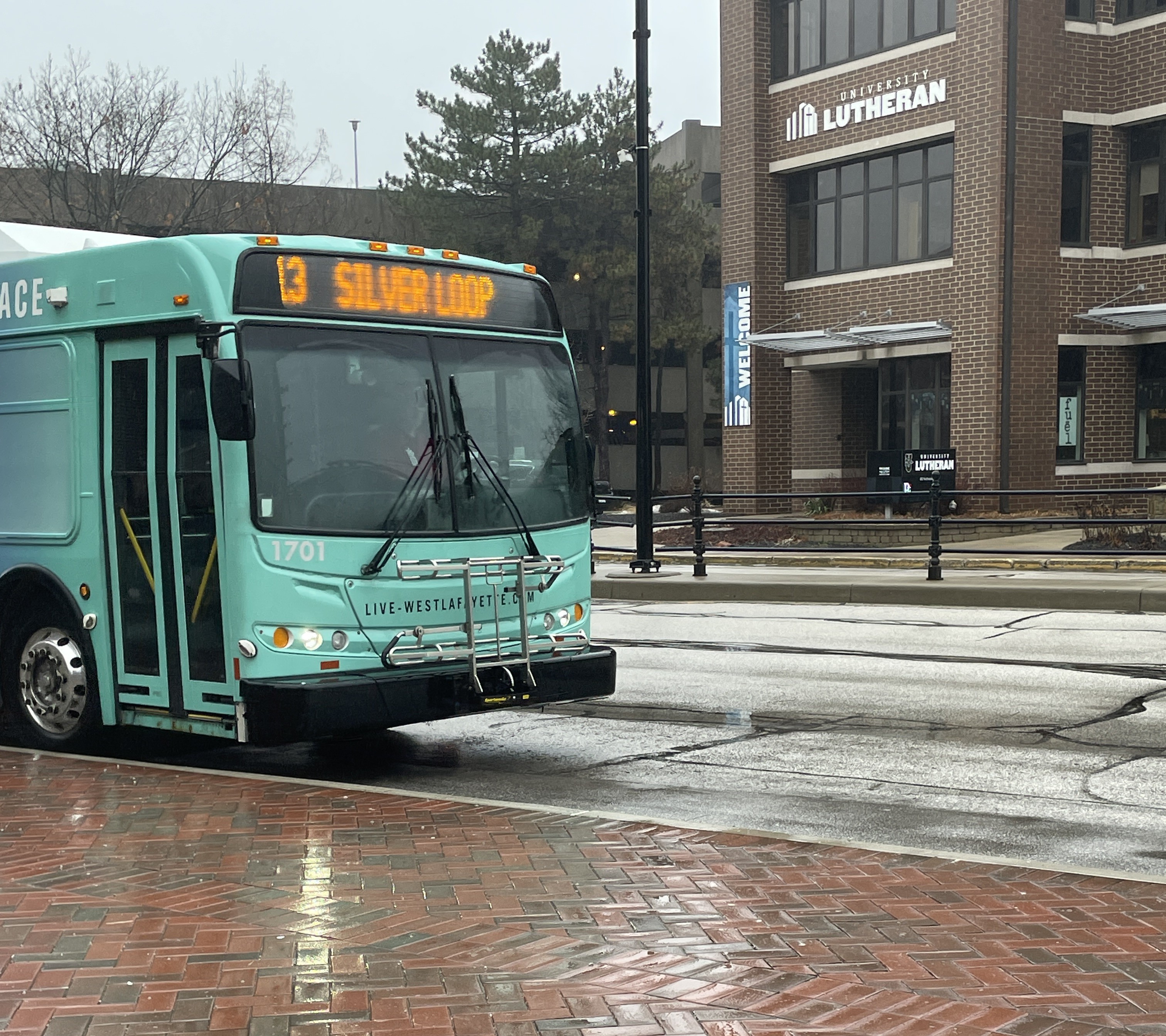
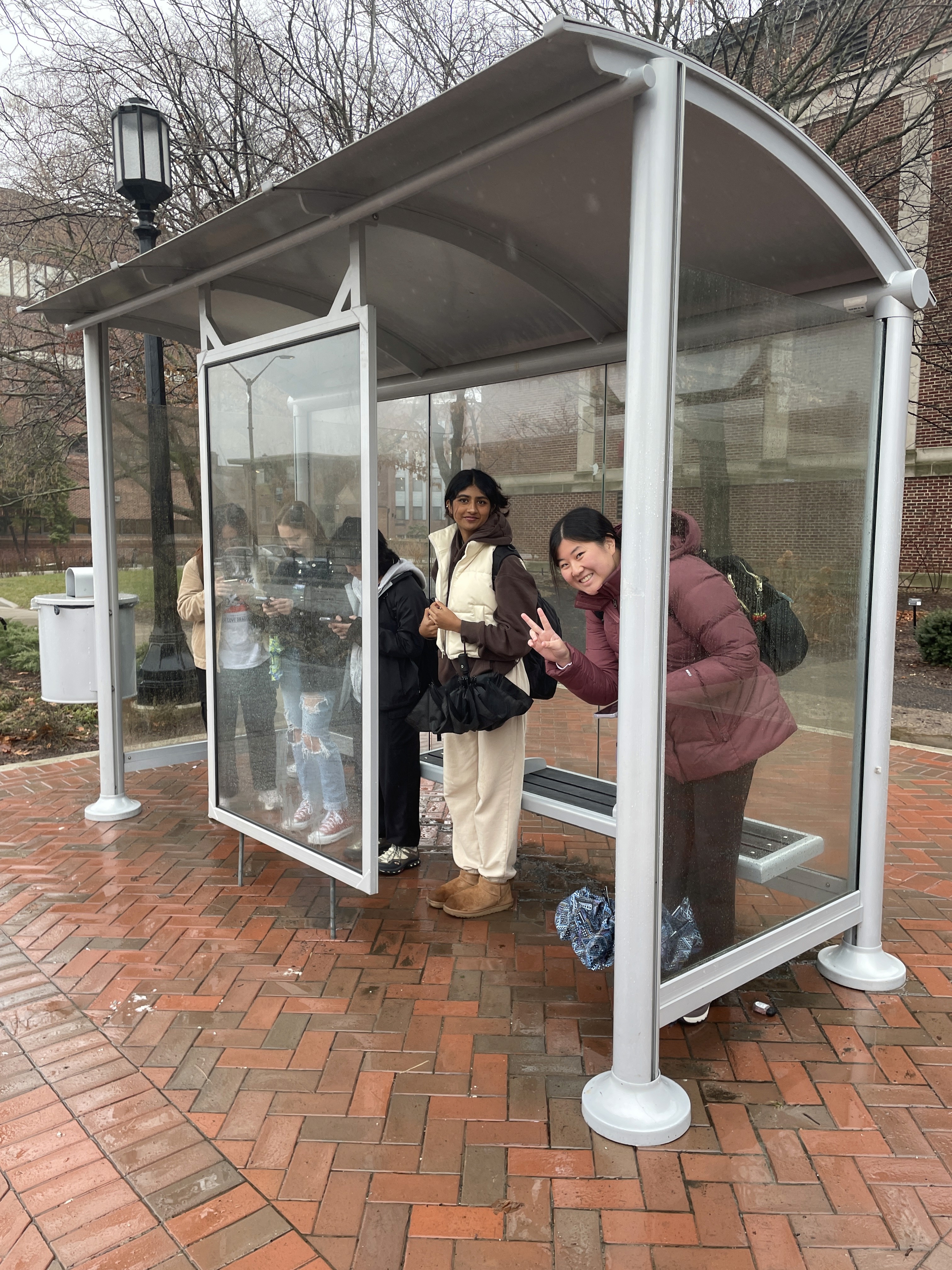
To identify key rider touchpoints and gain a general understanding of the bus experience, I conducted observations with my team. We split into three groups, rode different bus routes on and off campus, and took notes on the experience.
Route 01:
13 Silver Loop
Route 02:
4B to Walmart
Route 03:
1B to CityBus Center
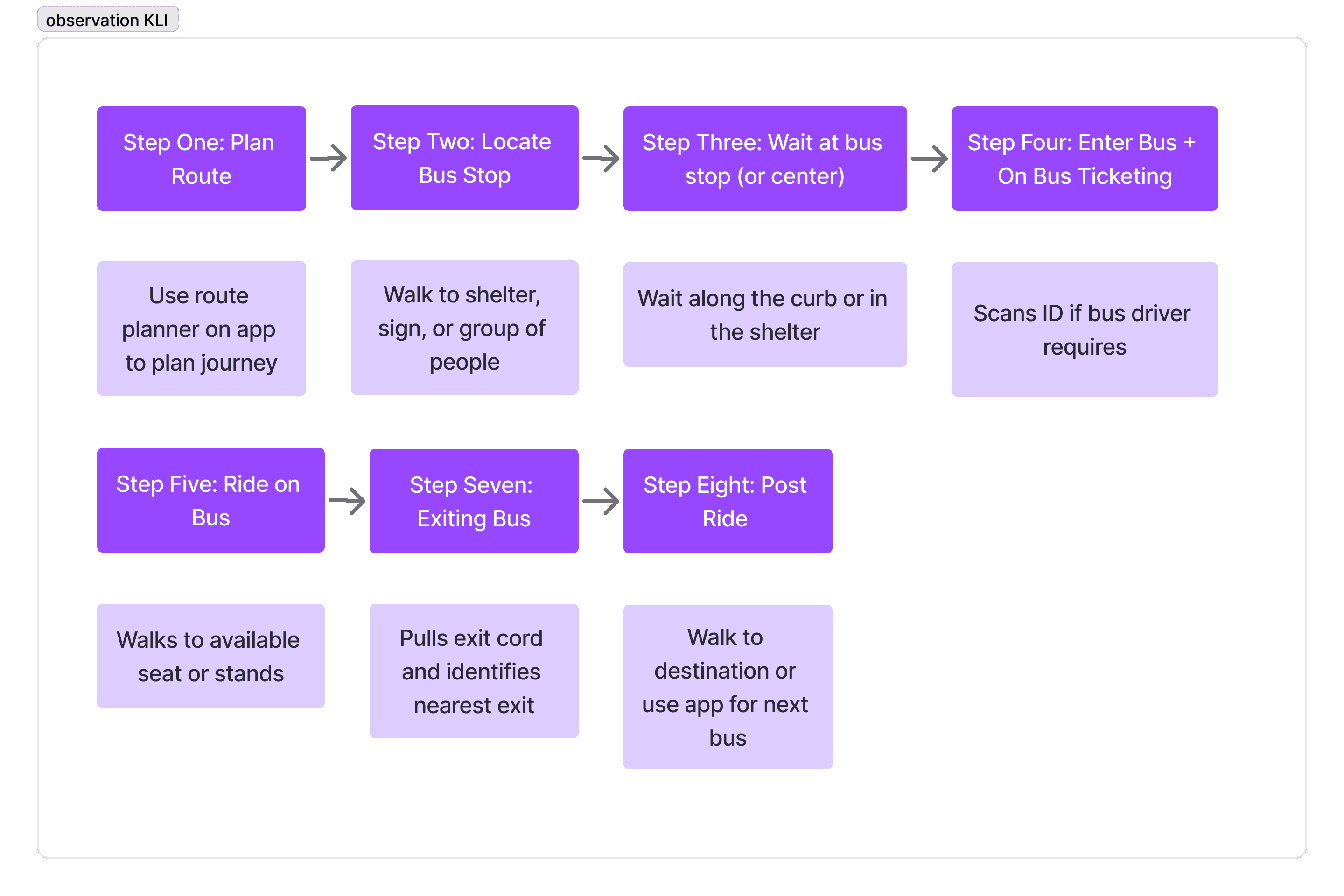
Through this activity, we identified seven key steps in the bus riding process, which became the foundation for our journey maps throughout the project.
I also identified major points of frustration to pinpoint common challenges and to refine our research focus.
Some bus stops are hard to find due to lack of signage, with some only recognizable by groups of waiting students. The app adds to the confusion by occasionally displaying inaccurate stop locations and failing to clearly indicate which side of the street the stop is on.
Pain points
Lack of signage causes frustration for riders as they have trouble identifying where to wait or which buses stop at that location.
Crowded shelters and bus force riders to wait in harsh weather conditions and difficulty navigating to seat or exit.
Unreliable MyCityBus app confuses riders by frequently displaying inaccurate or delayed arrival times.
Secondary Research
To gain deeper insights, we conducted secondary research to identify what users like and dislike about the MyCityBus app and understand key features of an effective passenger information system for public transportation.
Positive Reviews
The CityBus app’s live tracking is more accurate than scheduled arrival times, making it easier to locate buses.
Pain points
App glitches
Inaccurate bus times
Safety concerns at night
Well Designed PIS
App offers more features and information
Includes physical resources (map)
Usability Testing
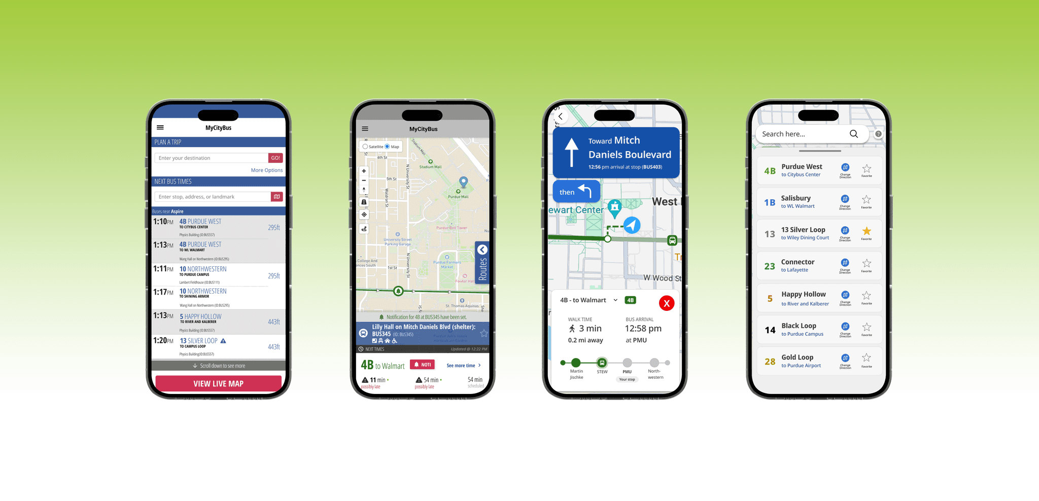
Since many rider issues during the observation and secondary research stemmed from the MyCityBus app, I conducted task-based usability testing to evaluate its features.
Method
Participants were prompted to think out loud while completing different scenarios on specific screens.
Insights
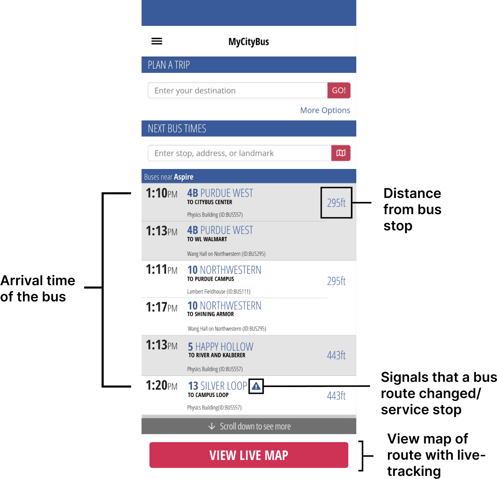
Inconsistent information throughout the app, with multiple screens displaying different bus arrival times.
Overcrowded information, overwhelming and confusing for users to find relevant information.
Lack of backtracking makes navigation frustrating, requiring users to repeatedly return to the main menu.
To make sense of the data from our first milestone, I created a journey map to capture the full CityBus experience, analyzing user pain points, navigation challenges, and areas for improvement. It served as a key reference for identifying design opportunities and shaping our solutions.
Locating a CityBus Touchpoint for Design
After mapping out key issues from user research to different points in the bus journey. I identified the most important and realistic opportunities for improvement.
Contextual Inquiry
I conducted a contextual inquiry to observe real-time rider behaviors, uncover hidden challenges, and understand how users adapt to the CityBus system in their daily commutes.
Method
I accompanied a Purdue student on the bus ride on one of the routes and encouraged them to share their thoughts out loud during the trip. I also asked follow-up questions to better understand how they navigate the bus system and what strategies they use to overcome challenges.
Insights
Communication and accessibility issues with a lack of information on signage.
Over-reliance on the app with little physical indicators.
To further focus on which pain points to prioritize, my team and I conducted guerilla testing, user survey, and an interview with the CityBus CEO.
Prioritization
Guerilla Testing
We aimed to identify the most valuable opportunities for students and collect quantitative data to measure the severity of key pain points.
User Survey
Our survey mirrored key questions from the guerrilla testing and was designed to reach a larger audience.
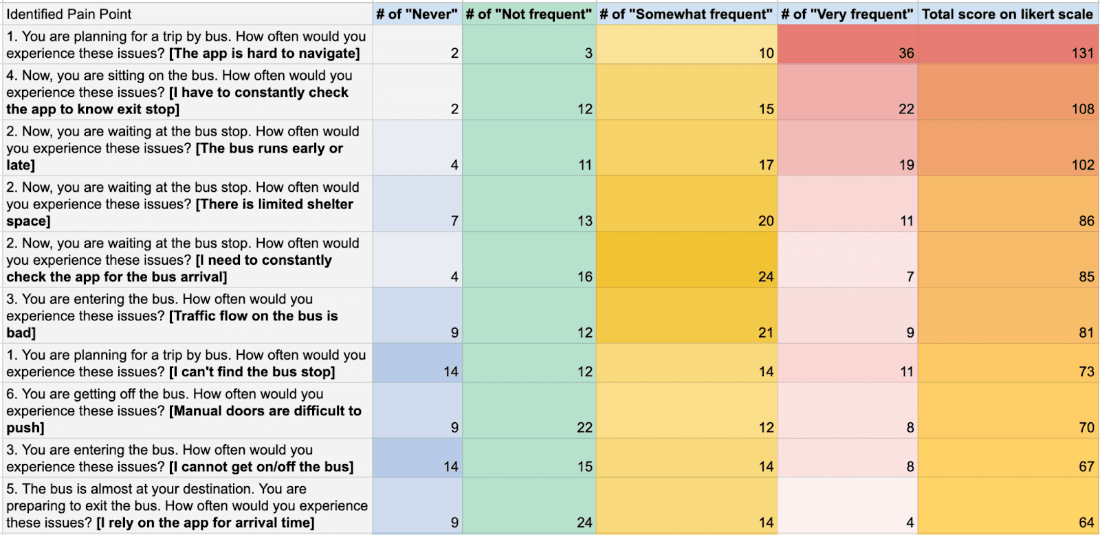
Top 10 Pain Points Identified Through Guerrilla Testing
Top 10 Pain Points Identified Through User Survey
These activities helped identify the most frustrating aspects of the CityBus experience and how often users encountered them. Both methods revealed similar findings, with the top issues being difficult app navigation, constant app checking, inconsistent bus timing, and inaccurate arrival estimates.
CEO Interview
The interview revealed that CityBus does not manage the app directly, physical infrastructure changes are costly, and app-related improvements would be the most feasible for implementation.
Designing for Identified Opportunities
After shifting our focus to the app for our redesign, we split into two teams—one to work on realistic, implementable improvements and the other to explore a more innovative, experimental redesign.
App Overhaul
Simple and Intuitive Navigation
I redesigned the app around a map-centric interface that highlights nearby routes and stops. Using GPS tracking, the app continuously updates to provide real-time bus and user locations for a more accurate and intuitive experience.
Reducing User Reliance on the MyCityBus App
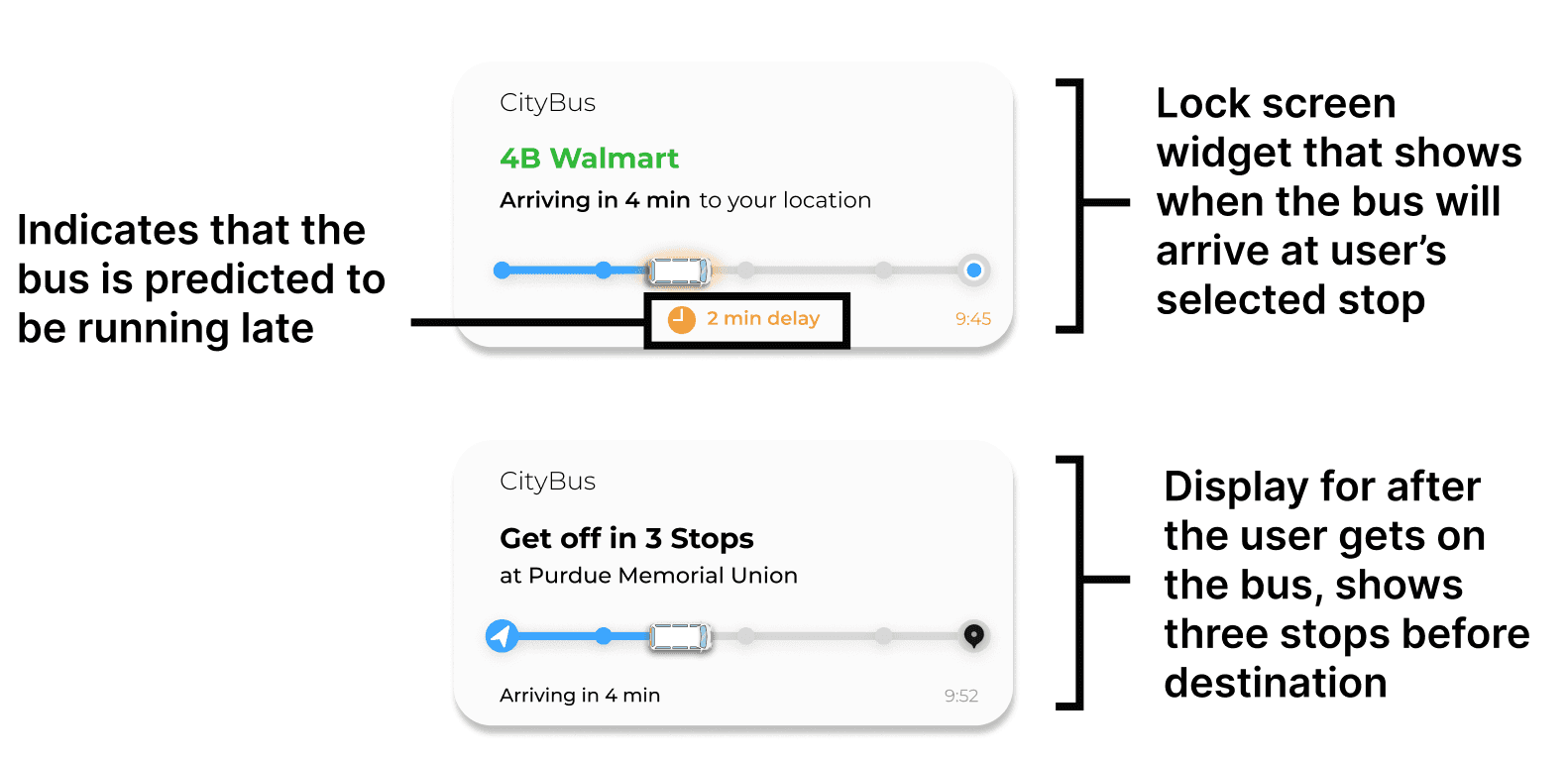
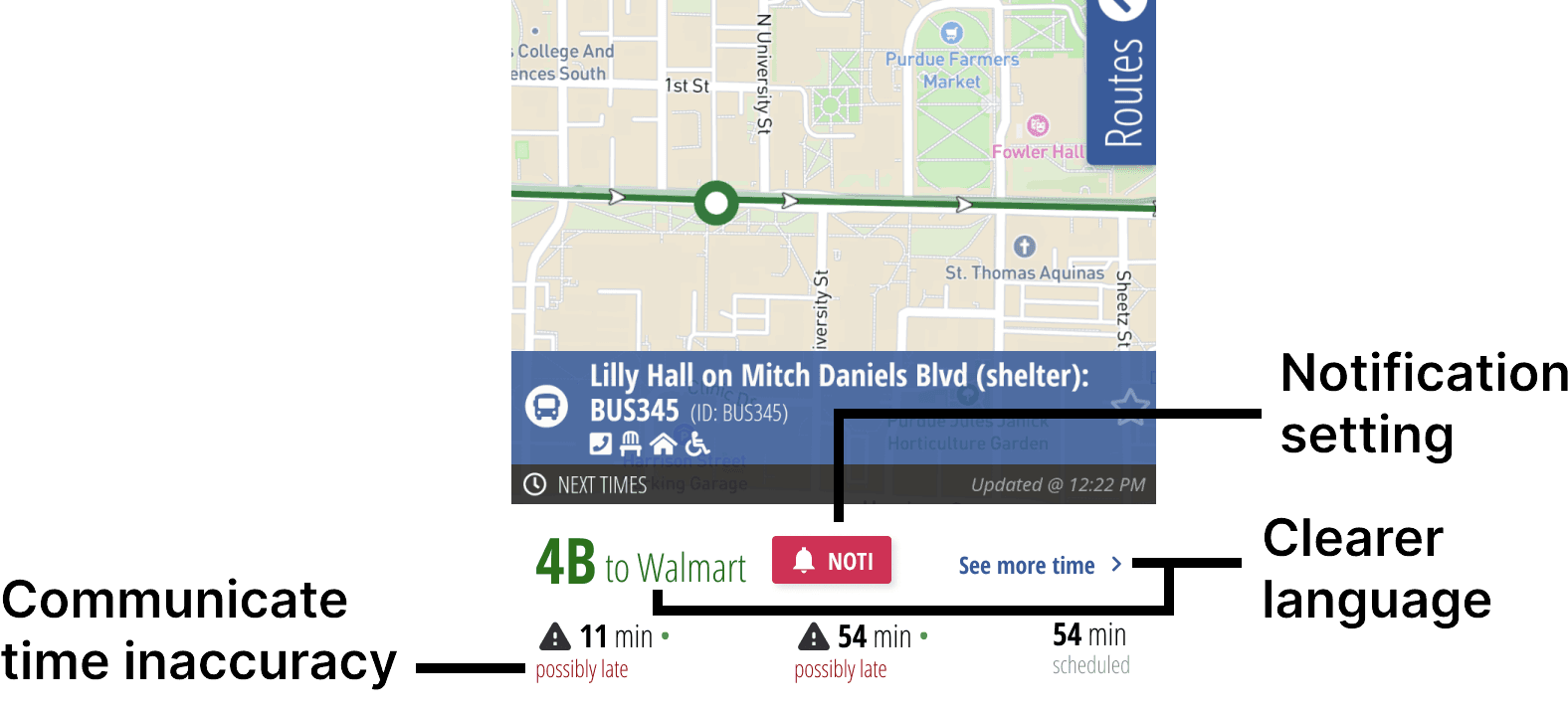
Improving Communication of Bus Times
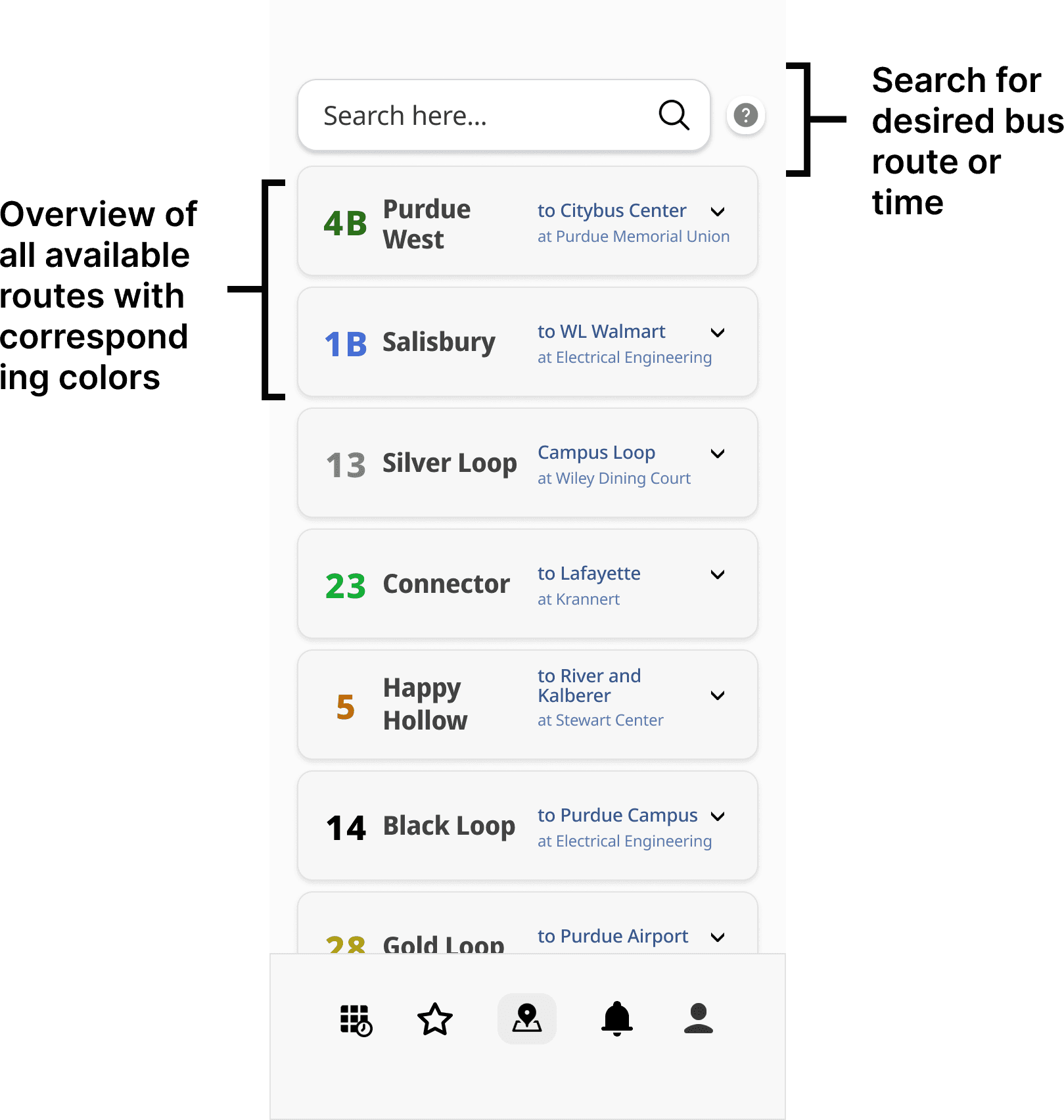
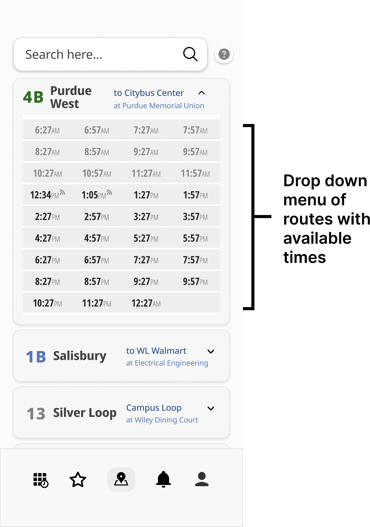
Current App Revisions
Optimized Communication of Bus Times
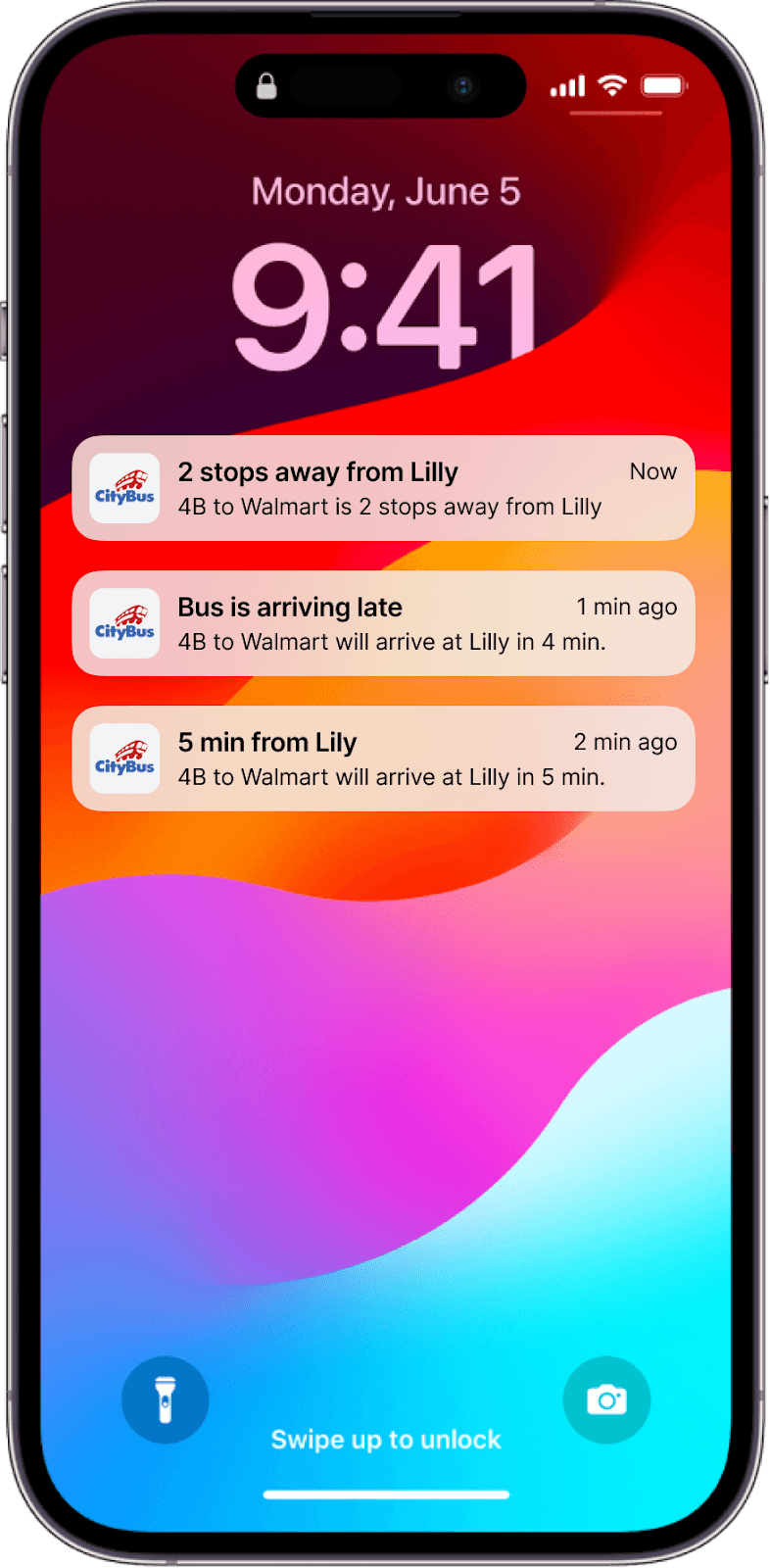
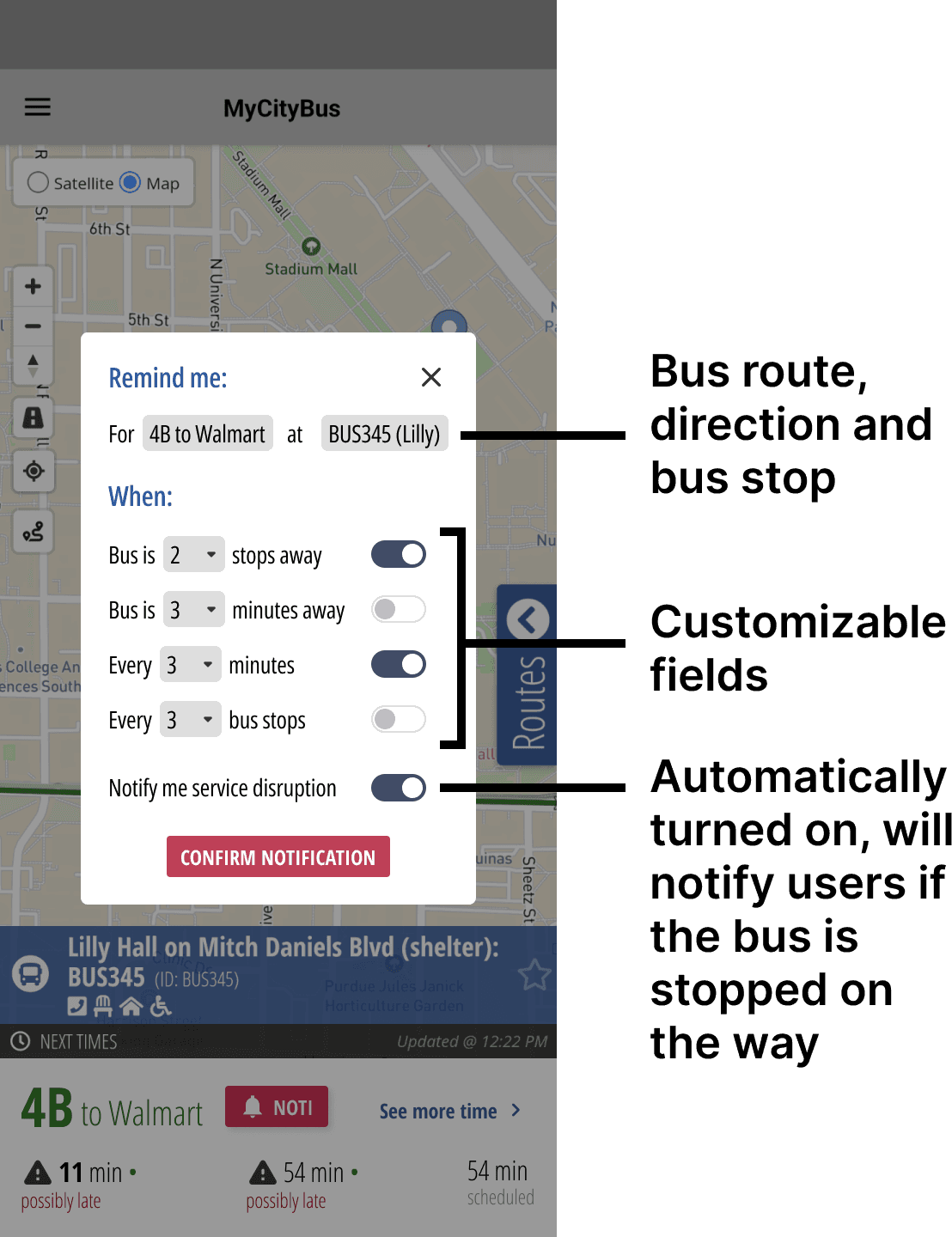
Notification System
Reflection
This project highlighted the impact of user research in driving meaningful design decisions. I learned how to balance ambitious ideas with feasibility, ensuring our solutions were both effective and realistic. It also showed me how small design changes, like clearer navigation or better time communication, can make a big difference in the experience.
Overall, this project gave me real experience with usability testing, from creating test scenarios to understanding how people interact with the app. It helped me learn how to find problems, understand user needs, and improve designs to make the app easier to use.